Simple! - Smartest Header In The World a Horror Story about skipping Content Projection
🔪 The Haunting Truth of Simple Architecture
Every project begins on sacred ground, pursuing the faint light of simplicity. But the path to clean code is a breachable fortress, constantly threatened by the screaming hordes of feature creep. The Simple Architecture Principle is not a guideline; it is a Tome of Ironclad Wards against this chaos, resting on two inviolable laws. The first is the purity of the Building Block — the Dumb Component — which must adhere strictly to its Minimum Viable Behavior (MVB). The second, and most vital, is the sacred ritual of Content Projection (slots, ng-content, template). To skip this ritual is to tear open a dimensional rift. It means surrendering your defenses, forging a single, monstrous component — a perfect synthesis of necessity and self-destruction — that holds too much power. You are not just a developer; you are creating the unholy mess that only the mighty Doom Slayer(who is a huge fan of the Simple! Architecture Principle BTW) himself would be called in to fix. The light fades, the Horror Story begins, and the Smartest Header in the World is born and is comming at you with all of its unholy minions
Who would win?
A bunch of unholy minions?
or this guy wilding a shotgun loaded with 2 rounds of Simple Architecture Principle

🚀 Mission 1: The First Sin
Alright, team, strap in. Forget the philosophical discussions and the Doom Lore — it’s time for some real-world project development, where “simple” means “implementing five features in one component.” Your first mission, should you choose to accept it (and you must, the launch is next week), is to forge the glorious Header Component for our new AI Chatbot. And because we have taste, it must use the gorgeous, minimalist style of Shadcn. This Header can’t just sit there looking pretty; it must become the first receptacle for complexity, featuring a collapsible control, a dynamic title, a share button for fleeting glory, and — because logic means nothing here — forward and backward arrows to navigate instantly between sessions. This is the bait that seals its fate: a component that does too much, too soon.
These are the initial input properties required bySmartestHeaderInTheWorld.vue
interface Props {
  title: string;
  showShareButton?: boolean;
  showLeftArrow?: boolean;
  showRightArrow?: boolean;
}

withDefaults(defineProps<Props>(), {
  showShareButton: true,
  showLeftArrow: true,
  showRightArrow: true,
});
We will be using those variables in the template below to conditionally display the controls:
<template>
  <header class="flex h-16 shrink-0 items-center gap-2 border-b">
   <div class="flex items-center w-full gap-2 px-3">
    <SidebarTrigger />
    <div class="w-full flex items-center justify-between">
     <div class="flex flex-row gap-1">
      <h1 class="text-1xl rounded-2xl p-2">
       {{ title }}
      </h1>
     </div>
     <div class="flex flex-row gap-2">
      <Button v-if="showShareButton" class="text-secondary"> <Share /> Share </Button>
      <Button v-if="showLeftArrow" class="text-secondary">
       <ArrowLeft />
      </Button>
      <Button v-if="showRightArrow" class="text-secondary">
       <ArrowRight />
      </Button>
     </div>
    </div>
   </div>
  </header>
</template>
The output is magnificent.

🚨 Mission 2: The Corruption Deepens
Just as we wipe the sweat from our brow, having successfully soldered the “Smartest Header In the World” with its collapsible sidebar control and completely sensible chat-time-travel navigation, a new, frantic email from the product owner crashes into the inbox. Brace yourselves for Mission 2: The Corruption Deepens! We’re no longer adding features; we are witnessing cellular component mutation. Firstly, the title needs to be editable. Secondly, those elegant forward/backward arrows? Gone. They are being immediately replaced with a high-stakes Delete Conversation button — because nothing streamlines the user experience like one-two-click digital annihilation — and a Settings button, which, let’s be honest, is where all the logic we can’t figure out will eventually be dumped. Our poor Header component is officially mutating from a reusable Building Block into a monstrous, single-point-of-failure Everything-Block. It’s simultaneously a display, an editor, a navigator, and an atomic bomb trigger. It’s glorious. And it’s going to be absolutely impossible to test.
We must adjust the interface and the defaults to support showEditButton, showDeleteButton, and showSettingsButton, leading to a total of seven boolean props—seven more chains binding it to its fate:
SmartestHeaderInTheWorld.vue
interface Props {
  title: string;
  // First header variant buttons
  showShareButton?: boolean;
  showLeftArrow?: boolean;
  showRightArrow?: boolean;
  // Second header variant
  showEditButton?: boolean;
  showDeleteButton?: boolean;
  showSettingsButton?: boolean;
}

withDefaults(defineProps<Props>(), {
  showShareButton: false,
  showLeftArrow: false,
  showRightArrow: false,
  showEditButton: false,
  showDeleteButton: false,
  showSettingsButton: false,
});
<template>
<header class="flex h-16 shrink-0 items-center gap-2 border-b">
<div class="flex items-center w-full gap-2 px-3">
<SidebarTrigger />
<div class="w-full flex items-center justify-between">
<div class="flex flex-row gap-1">
<h1 class="text-1xl rounded-2xl p-2">
{{ title }}
</h1>
<!-- Mission 2 Header is now Editable-->
<Button v-if="showEditButton" variant="secondary">
<Edit /> Edit
</Button>
</div>
<div class="flex flex-row gap-2">
<!-- Mission 1 Header Buttons -->
<Button v-if="showShareButton" class="text-secondary">
<Share /> Share
</Button>
<Button v-if="showLeftArrow" class="text-secondary">
<ArrowLeft />
</Button>
<Button v-if="showRightArrow" class="text-secondary">
<ArrowRight />
</Button>
<!-- Mission 2 Header Buttons -->
<Button v-if="showDeleteButton" class="text-secondary">
<Delete />
</Button>
<Button v-if="showSettingsButton" class="text-secondary">
<Settings />
</Button>
</div>
</div>
</div>
</header>
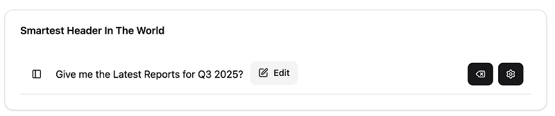
</template>As you can see, the Smartest Header In The World got a bit heavier, but that’s a non-issue because it only translates to seven different input properties — barely a ripple in the complexity pond. We’ve officially logged out for the day, having proved that we are Task Completionists first, and architects… well, maybe third or fourth. Time to wrap up for today. Heres a preview
🫠 Mission 3: The end of all things as we know it(or, “Wait, Where Did My Buttons Go?”)
Just when our brave little Header Component finishes processing its first existential crisis (switching from time-travel arrows to the nuclear “Delete” button), the project team drops a third, completely new requirement. Forget editing, deleting, or navigating old chats — that’s so last Tuesday. Mission 3 dictates that for an entirely new user flow, the Header must now become the central control for AI Model Selection. It still needs the reliable collapsible control and the Header Title, but everything on the right side is being immediately decommissioned in favor of a big, shiny dropdown menu where users can select ‘Genius Model’ or ‘Slightly Less Genius Model.’ We are now officially building three entirely different components that all occupy the same component. Our poor Header component now has the architectural personality of a chameleon trying to blend in with a plaid shirt, perfectly illustrating how requirements, much like stray console logs, never truly disappear — they just shift into a different, equally complex configuration.
Off we go. Further increase to complexity. Now we need quite a few new input properties: showSelectWidget, selectLabel, selectPlaceholder, selectOptions. No problem here, it's just four new properties, bringing our total to eleven cruel demands on the interface:
SmartestHeaderInTheWorld.vue
interface Props {
  title: string;
  // First header (Weather) buttons
  showShareButton?: boolean;
  showLeftArrow?: boolean;
  showRightArrow?: boolean;
  // Second header (Cost Analyst) buttons
  showEditButton?: boolean;
  showDeleteButton?: boolean;
  showSettingsButton?: boolean;
  // Third header (Select) functionality
  showSelectWidget?: boolean;
  selectLabel?: string;
  selectPlaceholder?: string;
  selectOptions?: string[];
}

withDefaults(defineProps<Props>(), {
  showShareButton: false,
  showLeftArrow: false,
  showRightArrow: false,
  showEditButton: false,
  showDeleteButton: false,
  showSettingsButton: false,
  showSelectWidget: false,
  selectLabel: "Select",
  selectPlaceholder: "Choose an option",
  selectOptions: () => [],
});
Let’s make the template changes. Well, we only just about need one new section for model selection, bind to it, and wire the output events, further complicating our single <template> block:
<template>
<header class="flex h-16 shrink-0 items-center gap-2 border-b">
<div class="flex items-center w-full gap-2 px-3">
<SidebarTrigger />
<div class="w-full flex items-center justify-between">
<div class="flex flex-row gap-1">
<h1 class="text-1xl rounded-2xl p-2">
{{ title }}
</h1>
<!-- Mission 2 Edit Button -->
<Button v-if="showEditButton" variant="secondary">
<Edit /> Edit </Button>
</div>
<div class="flex flex-row gap-2">
<!-- Mission 1 Navigation Buttons -->
<Button v-if="showShareButton" class="text-secondary">
<Share /> Share </Button>
<Button v-if="showLeftArrow" class="text-secondary">
<ArrowLeft />
</Button>
<Button v-if="showRightArrow" class="text-secondary">
<ArrowRight />
</Button>
<!-- Mission 2 Delete and Settings Buttons-->
<Button v-if="showDeleteButton" class="text-secondary">
<Delete />
</Button>
<Button v-if="showSettingsButton" class="text-secondary">
<Settings />
</Button>
<!-- Select Widget for "Last minute Layout Change" -->
<SelectWidget
v-if="showSelectWidget"
:label="selectLabel"
:placeholder="selectPlaceholder">
<SelectItem
v-for="option in selectOptions" :key="option" :value="option">
{{ option }}
</SelectItem>
</SelectWidget>
</div>
</div>
</div>
</header>
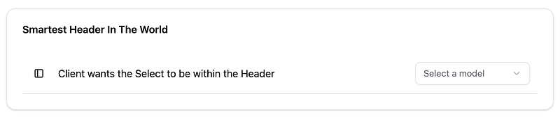
</template>End result — we absolutely nail this.
😈 The Price of Perfection: from Software as a Service to Technical Debt as a Service
And there you have it, folks! After successfully navigating Missions 1, 2, and 3, we haven’t built a simple Header; we’ve inadvertently constructed the most complex, over-engineered piece of UI in the application: The Smartest Header in the World. This single component now simultaneously manages a collapsible sidebar, an editable title, a Share button, and it needs to dynamically swap its controls between chat history navigation, deletion/settings/sharing, or a full-blown AI model selector based on which page it happens to be on. And, as you correctly noted — this is the truly terrifying part of “real-world” development — every single one of those actionable buttons leads to a deeper, nested interaction: Edit needs an input modal, Settings opens a modal with 12 options, and Delete requires the obligatory “Are you absolutely sure you want to digitally annihilate this conversation?” confirmation modal.
Magnificent work, team! You are a truly fantastic Task Completionist. You hit every deadline, you solved every corner case, and you successfully built the most convoluted, single-point-of-failure Header in the company’s history. This resulting Everything-Block is a 300-line monster, so dense with conditional logic that you are likely out of energy to even think about adding Unit Tests, let alone a full Cypress E2E suite. And since the deadline for the third mission was officially one day before you even got the first email, those tests are an easy, required skip, right? You delivered the features, but remember this dark truth: name one person those omitted tests would have actually helped. It certainly wasn’t you. It’s the poor, unsuspecting successor who will be tasked with fixing this magnificent, unholy mess a year from now, long after you and the original Product Owner have moved on to sunnier, less-bug-ridden projects. Congratulations — you’ve just paid off the business’s feature debt by creating a glorious monument to technical debt for the future.
💥 The Cleansing Fire: Re-Enforcing MVB
<template>
  <Header title="Building Blocks - MVB + Content Projection"></Header>
  <div class="p-10">
   <h1 class="text-2xl my-5">Mission 1 - Header Variant</h1>
   <Card>
    <CardHeader>
     <CardTitle>Smartest Header in the World</CardTitle>
    </CardHeader>
    <CardContent>
     <SmartestHeaderInTheWorld
      :showLeftArrow="true"
      :showRightArrow="true"
      :showShareButton="true"
      title="Whats the Weather in Sweden?" />
    </CardContent>
   </Card>

   <h1 class="text-2xl my-5">Mission 2 - Header Variant</h1>
   <Card>
    <CardContent>
     <SmartestHeaderInTheWorld
      :showDeleteButton="true"
      :showEditButton="true"
      :showSettingsButton="true"
      title="Give me the Latest Reports for Q3 2025?" />
    </CardContent>
   </Card>

    <h1 class="text-2xl my-5">Mission 3 - Header Variant</h1>
    <Card>
     <CardContent>
      <SmartestHeaderInTheWorld
       :selectOptions="AI_MODELS"
       :showSelectWidget="true"
       selectLabel="AI Models"
       selectPlaceholder="Select a model"
       title="Client wants the Select to be within the Header" />
     </CardContent>
    </Card>
  </div>
</template>
Preview

After witnessing the terrifying sight of our three completed missions — all those conditional arrows, delete buttons, and dropdowns crammed into a single component — it is easy to see why the non-technical staff, like the Product Owner, proudly calls it “A Job Well Done.” But what they see as functionality, we recognize as a monstrous, unholy amalgam. Now is the time for architectural violence. We are strapping on the Praetor Suit, grabbing the Super Shotgun of MVB, and preparing for the deployment. Rip and Tear, Rip and Tear, Rip and Tear, Rip and Tear

Our first step to fix this disaster is to radically simplify our Header component: we are stripping it down to its bare, pure essence. It must only contain the elements that are always present in every single variant: the Collapsible Control and the Title. Everything else — all navigation, editing, model selection, and deletion buttons — is complexity that needs to be evicted immediately. This is not refactoring; this is an Exterminatus to purge the Everything-Block and reclaim a single, reusable Building Block.
💀 The Dead Giveaway: What’s in a Name?
We need to pinpoint the moment the corruption truly began, and the clue is right there in the component’s original DNA — its name. While still full of hope and a naïve desire not to summon a bunch of unholy minions, we christened it HeaderComponent. This name is a dead giveaway, and it dictates the law of MVB. If the answer to any question is "No," that responsibility must be purged immediately.
Let’s be ruthlessly logical:
- Is the
HeaderComponentresponsible for the Collapse Control? Yes. In current year, this is super trendy and modern; the sidebar trigger almost always lives in the header. - Is the
HeaderComponentresponsible for the Title? Yes. It defines the content of the current view.
Now for the questions that lead to our reckoning:
- Is the Header responsible for Deleting Conversations? (No.)
- Is it responsible for Navigating between conversations? (No.)
- Is it responsible for Edit functionality, AI Model DROPDOWNS, or Settings management? (Absolutely not.)
The answer is a resounding No. Every feature beyond the collapse control and title is a piece of foreign, infectious complexity. We are not just fixing code; we are performing an exorcism. It’s time to obey the name we originally gave it and dial back the Header to its pure, dumb state.
💥 The Reckoning: Purging the Everything-Block
The time for analysis is over; the time for architectural violence has arrived. This is the Reckoning. We will purge every piece of contaminating logic from the HeaderComponent and offload that responsibility to the only entity capable of managing it: the respective Parent (Smart Component).
The law of MVB is absolute: the Header is only responsible for the — the collapsible sidebar trigger and the title display. Everything else is unholy. Every single one of the eleven conditional props (showDeleteButton, showSelectWidget, showLeftArrow, etc.) must be deleted. Every nested v-if statement that determined which button should exist is being incinerated.
To handle the three entirely different UI configurations we built across Missions 1, 2, and 3, we deploy the ultimate weapon against complexity: Content Projection (or slots). We are turning our Smartest Header in the World into the Dumbest Frame in the World by introducing two simple, clean extension points:
- Called Actions — this houses actions that will be on the right side and close to the title that is perfect for Edit functionality.
- A secondary, named slot (e.g.,
[#controls]) for any buttons or unique widgets that might be on the right side.
This is the ultimate offloading mechanism. The Header component stops knowing about the Delete button or the Model Selector. It simply provides a sanitized conduit (the slot) for the Parent to project its own customized UI structures inward. We are not nesting complexity; we are surgically injecting controlled UI features. The Doom Slayer has successfully reclaimed the Header building block.
Header.vue
interface Props {
 title: string;
}

withDefaults(defineProps<Props>(), {
 title: "",
});
and its glorious template
<template>
  <header class="flex h-16 shrink-0 items-center gap-2 border-b">
   <div class="flex items-center w-full gap-2 px-3">
    <SidebarTrigger />
    <div class="w-full flex items-center justify-between">
     <div class="flex flex-row gap-1">
      <h1 class="text-1xl rounded-2xl p-2">
       {{ title }}
      </h1>
      <slot name="actions"></slot>
     </div>
     <div class="flex flex-row gap-2">
      <slot name="controls"></slot>
     </div>
    </div>
   </div>
  </header>
</template>
✨ Redemption: The Power of the Empty Vessel
Though purged and stripped of its eleven controlling props, the Header is not powerless; it is, in fact, the perfect vessel. How do we achieve the same feature parity without the dreaded effort multiplier? The answer lies in realizing that the Building Block’s job is not to know, but to host. We have traded the monstrous complexity of conditional logic for the pristine simplicity of Content Projection.
The Header now performs its MVB — providing the collapse control and title — and opens a single slot (or extension point) for the parent to use. Now, when the parent needs the destructive Mission 2 buttons, it builds that specific UI structure in its own template and projects it inward. When it needs the Mission 3 model selector, it builds that structure and projects it instead. The Header component itself never needs to change, never needs another v-if, and never needs more than its two original responsibilities. The complexity is defeated, not by deletion, but by isolation. We have forced the chaos to live externally, contained and controlled by the responsible party.
This is how to use the new Header.vue
<template>
  <Header title="Building Blocks - MVB + Content Projection"></Header>
  <div class="p-10 overflow-y-auto">
   <h1 class="text-2xl my-5">Reckoning</h1>
   <Card>
    <CardHeader>
     <CardTitle>Header + MVB in its most pure form</CardTitle>
    </CardHeader>
    <CardContent>
     <Header title="Building Blocks - MVB + Content Projection"></Header>
    </CardContent>
   </Card>

   <h1 class="text-2xl my-5">Mission 1 - Redemption</h1>
   <Card>
    <CardHeader>
     <CardTitle>Header + MVB and Content Projection</CardTitle>
    </CardHeader>
    <CardContent>
     <Header title="Whats the Weather in Sweden?">
      <template #controls>
       <Button class="text-secondary"><Share /> Share</Button>
       <Button class="text-secondary"><ArrowLeft /></Button>
       <Button class="text-secondary"><ArrowRight /></Button>
      </template>
     </Header>
    </CardContent>
   </Card>

   <h1 class="text-2xl my-5">Mission 2 - Redemption</h1>
   <Card>
    <CardHeader>
     <CardTitle>Header + MVB and Content Projection</CardTitle>
    </CardHeader>
    <CardContent>
     <Header title="Give me the Latest Reports for Q3 2025?">
      <template #actions>
       <Button variant="secondary">Edit</Button>
      </template>
      <template #controls>
       <Button class="text-secondary"><Delete /></Button>
       <Button class="text-secondary"><Settings /></Button>
      </template>
     </Header>
    </CardContent>
   </Card>

   <h1 class="text-2xl my-5">Mission 3 - Redemption</h1>
   <Card>
    <CardHeader>
     <CardTitle>Header + MVB and Content Projection</CardTitle>
    </CardHeader>
    <CardContent>
     <Header title="Client wants the Select to be within the Header">
      <template #controls>
       <SelectWidget label="AI Models" placeholder="Select a model">
        <SelectItem v-for="model in AI_MODELS" :value="model">
         {{ model }}
        </SelectItem>
       </SelectWidget>
      </template>
     </Header>
    </CardContent>
   </Card>
  </div>
</template>
🎖️ End Game: The Purification of the Codebase
The battle is won. We have defeated the unholy minions of conditional complexity by applying both fundamental patterns: Minimum Viable Behavior (MVB) and Content Projection.
This successful exorcism means we now create components focused only on their core functionality. Everything else — from the Delete button to the Model Selector — is defined as a pristine extension point (the slot) where the Parent component can safely attach and inject its specific complexity and behavior. With this approach, the Smart Component is forced to embrace its actual role: responsibility for the complexity it owns. Since the Parent deals with the specific topics (like the Conversation or ModelSelection), it is far more likely to know the required behavior than the generic Header.
The Header Component is redeemed. It is now truly reusable, requiring almost no inputs.
Now that this segment of the battlefield is clean, the real threat emerges from the shadows. The next source of complexity isn’t structural; it’s behavioral logic hidden across services and utilities. Grab your Plasma Rifle, and prepare your soul: we are off to tackle the next topic, Composable Behavior and the biggest threat to Simple Architecture Principle: Nesting Store Workflows within Worflows within Workflows within Side Effects.